The Role of Color Psychology in Packaging Design
Table of Contents
In the world of packaging design, color psychology plays a vital role in shaping consumer perceptions and influencing their buying decisions.
The right choice of colors can evoke powerful emotions, create strong brand identity, and even impact product preference among your target audience. In this blog post, we’ll explore the importance of color psychology in packaging design and how marketers can harness its potential to enhance product appeal and increase sales.
Key Takeaways
- Color psychology is crucial in packaging design as it impacts consumer behavior and emotions, enhances brand recognition, and ultimately influences buying decisions.
- Different colors have different meanings and can trigger distinct emotions. For example, white communicates purity and simplicity while black represents luxury and sophistication.
- It’s important to choose the right color scheme for your product by conducting color research to understand your target audience, considering your product and brand identity, incorporating color trends, and choosing the right color combination for your packaging design.
Understanding The Importance Of Color Psychology In Packaging Design

Color psychology in packaging design is crucially important as it impacts consumer behavior and emotions, plays a significant role in branding and strategic marketing, and ultimately influences buying decisions.
The Impact Of Color On Consumer Behavior And Emotions
The impact of color on consumer behavior and emotions is a crucial aspect that businesses need to consider when designing product packaging. Different colors have the power to evoke various feelings, perceptions, and associations in customers’ minds.
For example, warm hues like red and orange can stimulate excitement and passion, while cool tones such as blue or green convey calmness, trustworthiness, or environmental consciousness.
An excellent illustration of this concept involves Coca-Cola’s iconic red branding. This bold choice not only makes their products stand out on store shelves but also elicits strong positive feelings associated with warmth, energy, happiness – all characteristics consumers tend to associate with enjoying carbonated beverages.
In essence, understanding the psychological effects of color on consumers’ emotional responses is vital for businesses aiming to create engaging packaging designs that grab attention and drive sales.
The Role Of Color In Branding And Packaging Design
The use of color in branding and packaging design goes beyond just making a product visually appealing. Colors have psychological implications that can communicate the brand’s personality, values, and message to consumers.
For example, the popular food delivery service Grubhub uses orange to convey fun and enthusiasm while also stimulating appetite. On the other hand, luxury brands like Chanel use black and white for their minimalist packaging designs to communicate sophistication and elegance.
How Color Influences Buying Decisions
The use of color in packaging design has a significant influence on consumer behavior and decision making. Studies have consistently shown that color is the first thing consumers notice about a product, with up to 90% of snap judgments based solely on color.
For instance, warm colors like red, orange, and yellow tend to evoke emotions such as excitement, enthusiasm, and hunger. This makes them ideal for food products or items meant to stimulate appetite.
On the other hand, cooler shades like blue and green are associated with calmness, tranquility, healthiness – perfect tones for beauty products or healthcare brands.
The Meaning Behind Different Packaging Colors

Packaging colors have different meanings and can trigger distinct emotions, for example, white communicates purity and simplicity while black represents luxury and sophistication.
White: Purity, Simplicity, New Beginnings
White is a popular color in packaging design, commonly associated with purity and simplicity. It communicates innocence, equality, and new beginnings as it gives the impression of a blank canvas.
This shade is often used for products that promote hygiene or cleanliness such as skincare or household items. The use of white in packaging provides customers with a sense of trustworthiness and reliability because it suggests transparency and authenticity in the product.
However, overuse of white can also make a product appear too clinical or bland.
Black: Sophistication, Power, Luxury
The color black is often associated with sophistication, power, and luxury in packaging design. It’s no surprise that many high-end brands use this color to communicate a sense of status and exclusivity to their customers.
Marketers have historically used black in packaging design for products like expensive watches or designer clothing lines. However, this doesn’t mean that every brand should incorporate the color into their packaging.
When considering using black in your product packaging, remember to take into account your target audience and brand identity.
Red: Energy, Passion, Excitement
Red is a bold and passionate color that conveys energy, excitement, and intensity. It’s often used in packaging design for products such as food and beverages since it stimulates appetite and increases heart rate.
Red also suggests urgency, making it an ideal choice for limited edition or seasonal items where a sense of scarcity can lead to higher sales. For example, Coca-Cola uses red in its packaging to convey the brand’s high-energy image while also creating a positive emotional response among consumers.
Green: Growth, Nature, Health
Green is often used in packaging design to communicate growth, nature, and health. It’s a color that brings to mind fresh produce or natural remedies. For example, companies selling supplements will often use green on their packaging to evoke a sense of purity and healthiness.
Green is also associated with environmentalism, making it popular for eco-friendly products like reusable containers or cloth bags.
In conclusion, leveraging the power of green in your packaging design strategy can be an effective way to communicate messages about growth, nature, and health while appealing to consumers’ desire for eco-friendly and wellness-oriented products.
Blue: Trust, Honesty, Stability
Blue is a popular choice for packaging design as it represents trust, honesty, and stability. This color is often used to convey the message that the product or brand can be relied upon.
For example, financial institutions use blue in their branding and packaging to communicate a sense of security and dependability to customers.
Incorporating shades of blue into your packaging can create a sense of confidence amongst consumers towards your brand or product which can positively impact buying decisions.
It’s important to choose the right shade of blue for your target audience since different hues have varying effects on emotions.
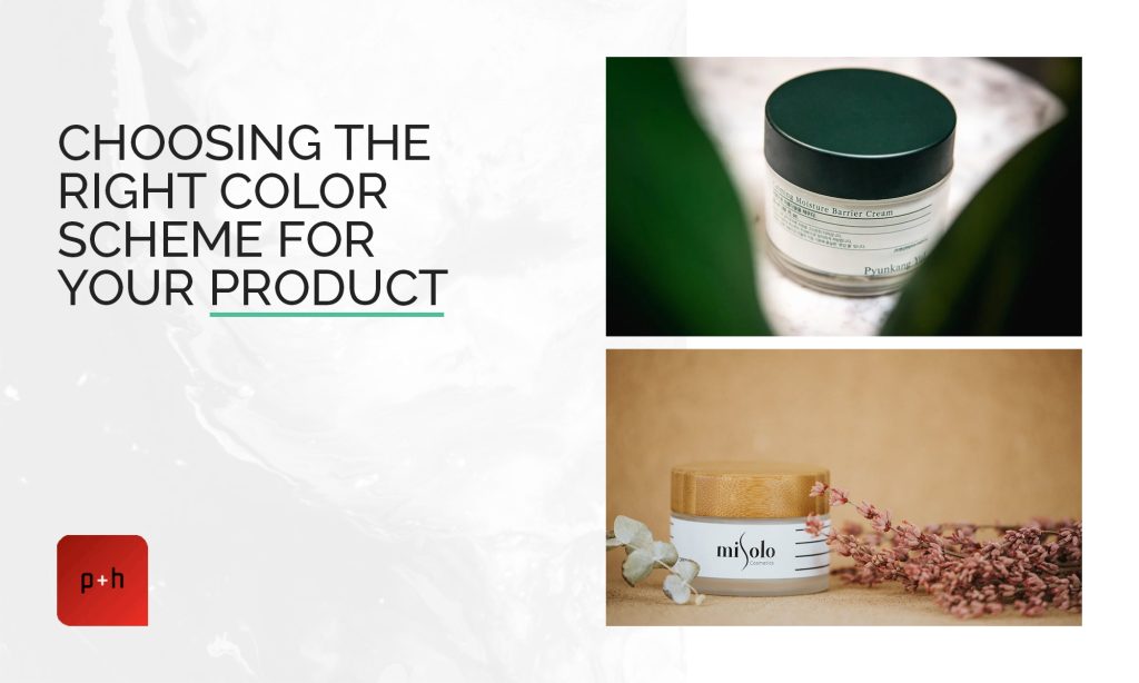
Choosing The Right Color Scheme For Your Product

Conduct color research to understand your target audience, consider your product and brand identity, incorporate color trends, and choose the right color combination for your packaging design.
Conducting Color Research To Understand Your Target Audience
Understanding the color preferences of your target audience is essential in creating packaging that appeals to them. Here are some steps to take when conducting color research:
- Identify your target market and their demographics, including age, gender, location, and interests.
- Conduct surveys or interviews with your target audience to gather insights on their color preferences and associations.
- Analyze data from previous marketing campaigns and sales to identify which colors were most effective in appealing to your audience.
- Look at competitor packaging designs and identify which colors they use, and how it affects their branding and product perception.
- Use color psychology theories to help guide your research, identifying which colors elicit specific emotions or perceptions in consumers.
By conducting thorough color research, you can better understand your target audience’s color preferences and create packaging that appeals to them while also standing out from competitors.
Considering Your Product And Brand Identity
When designing product packaging, it’s important to consider the unique identity of your brand and product. You want your packaging to stand out on shelves, but also accurately represent what’s inside.
For example, if you’re selling eco-friendly products, incorporating green tones into your packaging can communicate that message to consumers before they even read a label.
It’s also essential to think about how different color combinations will affect the overall perception of your product. A bold red and black design may be eye-catching for some products, but it might not fit with a more natural or wholesome image.
Take time to research color psychology theories and experiment with different palettes that reflect both your brand personality and the product being sold.
Incorporating Color Trends
Incorporating color trends into packaging design can be a great way to stay current and relevant in the market. It’s important to do your research and understand what colors are currently popular in your industry, as well as what may be up-and-coming.
However, it’s also crucial to consider how these trends align with your brand identity and target audience. For example, pastel tones have been trending in many areas of design recently, but they may not be appropriate for a product targeting a more masculine demographic.
Choosing The Right Color Combination For Your Packaging Design
The right color combination can make or break your packaging design. Here’s how to choose the perfect blend for your product:
- Conduct color research to understand your target audience, their preferences, and cultural differences that affect color perception.
- Consider your product and brand identity. What is the message you want to convey? What emotions do you want to evoke with your packaging?
- Incorporate color trends into your design but avoid being too trendy as it could date quickly.
- Choose a color combination that is easy on the eyes – avoiding clashing hues.
- Use contrasting colors judiciously to create visual impact and attract attention to important elements like the product name, logo, or tagline.
- Keep in mind print constraints when choosing colors for packaging design, not all printing machines can produce all colors accurately.
- Finally, test several designs with a focus group before making a final decision. Get feedback and analyze which option resonates most with customers.
By thoughtfully selecting the right color combination for your packaging design based on these factors, businesses can benefit from increased brand awareness and better customer engagement leading to more sales conversion opportunities over time.
Leveraging Color Psychology In Your Packaging Design Strategy

By incorporating color psychology in your packaging design strategy, you can differentiate from competitors, target specific demographics, create a cohesive brand identity, and increase visual impact.
Using Color To Differentiate From Competitors
Color is a powerful tool for standing out on store shelves and differentiating your product from competitors. By selecting unique colors or incorporating color contrast in your packaging design, you can create a visual impact that captures consumers’ attention.
For example, Coca-Cola’s signature red and white packaging immediately stands out against other soft drink brands that use more muted colors.
However, it’s important to consider the industry norms when choosing packaging colors. While standing out is crucial, straying too far from industry conventions could also alienate potential customers who are used to certain design standards.
Targeting Specific Demographics With Color
Understanding the demographics of target customers is crucial in creating effective packaging design. Using color psychology, businesses can tailor their product packaging to specific audiences.
For example, studies have shown that women are more likely to be attracted to products with light blue or purple hues, while men tend to favor darker colors like black and blue.
Similarly, baby boomers may respond more positively to traditional colors like navy blue and forest green, while millennials lean towards brighter shades like pink and yellow.
Incorporating these color preferences into package designs can significantly influence a customer’s buying decision and increase overall engagement with the product.
Creating A Cohesive Brand Identity Through Color
Color plays a vital role in creating a cohesive brand identity. Using consistent colors across all packaging designs allows businesses to establish themselves as easily recognizable and distinguishable from competitors.
Take Coca-Cola, for example, their iconic red and white logo is instantly recognizable worldwide and has become synonymous with happiness, refreshment, and nostalgia. By consistently using their signature colors throughout their products’ packaging design, Coca-Cola reinforces its brand message while providing peace of mind to loyal customers who know exactly what they’re getting regardless of where in the world they are.
Incorporating Color Contrast To Create Visual Impact
Color contrast can be a useful tool in packaging design to create visual impact and engage consumers. This is done by pairing colors that are opposite on the color wheel, such as blue and orange or red and green.
The use of contrasting colors creates a bold design that catches the viewer’s eye and draws attention to the product.
When choosing contrasting colors for your packaging design, it’s important to consider how they represent your brand and product as well as their impact on consumer emotion.
A balance between contrasting hues is crucial for an effective contrast without being overwhelming or confusing for customers.
Conclusion
In conclusion, color psychology plays a critical role in packaging design. By selecting the right colors for your product, you can influence consumer behavior, create brand recognition, and differentiate yourself from competitors.
Understanding the meaning behind different colors and conducting research on your target audience are crucial steps in creating impactful packaging design. Incorporating color trends and contrast can also help make your product stand out visually.
FAQs:
How does color psychology impact consumer behavior when it comes to packaging design?
Color psychology plays a significant role in shaping consumer perceptions and emotions towards products, which can influence purchase decisions. The colors used in packaging design evoke different emotions and associations that can either attract or deter shoppers.
Which specific colors are commonly associated with certain product categories?
Red is often used for food products as it evokes feelings of appetite and urgency while blue is commonly used for health and beauty products as it suggests purity, cleanliness, and calmness. Green is often associated with natural or environmentally friendly products while black creates a sense of luxury or sophistication.
Can the use of too many colors in packaging design be detrimental to sales?
The use of too many colors could overwhelm consumers visually and make them less likely to pick up the product off the shelf. It’s important for brands to strike a balance between using enough vibrant colors to stand out without being overwhelming or detracting from the main message.
Is there any research that supports the effectiveness of color psychology in packaging design?
A wealth of scientific studies has shown that consumers’ perception towards a brand’s messaging & values are impacted by visual components such as logos & imagery along with preference on favored shades tonality combinations etcetera; not only color but also texture play an important role within this context – meaning we can’t underestimate just how much these aspects will affect buying patterns over time!


