The Importance of Color Proofing in Package Design
Does brilliant design always lead to great packaging?
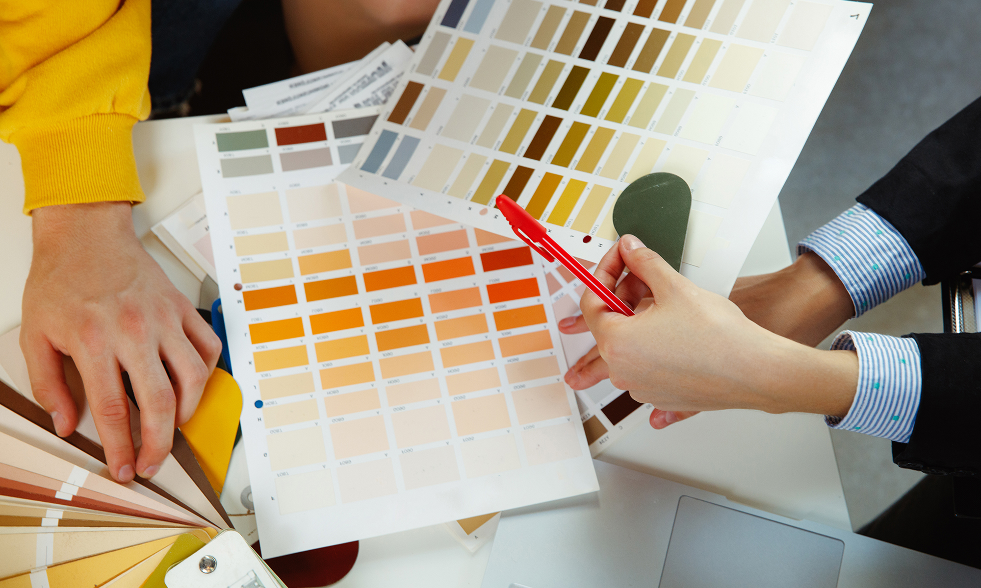
We’ve seen it lots of times before. A marketing team approves beautiful new packaging designs and the instinct is to immediately convert them to print-ready files and then send italong to their printer. The team gets the first run of packaging back, but something seems off. The color isn’t as bright or the shade is just slightly off or the special effects came out different. Did the printer miss something? No. But the marketing team did. A very important step called: Color Proofing.


If you are starting a new packaging design project or in the middle of one-now is a great time to look for a packaging design agency that has color proofing specialists. It requires expertise across a wide range of packaging materials, an artist’s eye for color and a patience and persistence to get all the colors and effects right down to the very last detail. At Partners +Hunt, we specialize in helping clients at this critical juncture between beautiful package design and the final printed product.
Partnering with Wilderness Family Naturals, an organic food company, to ensure that their beautiful, bold package design made its way all the way to the printer is one of our favorite examples.
Wilderness Family Naturals worked with designer Jenney Stevens to create a fresh new design that perfectly embodied their updated brand name, Wildly Organic. Her use of bold, rich colors with gradient finishes were sure to make the packaging standout but they also needed a packaging expert to ensure that her designs would translate across multiple printers and package types. That’s where P+H teamed up with Jenney.
Meticulous to our core–we are obsessed about colors, materials and printing to ensure that what is approved is exactly what gets printed. This is how brilliant design gets translated into great packaging. To get consistent colors across different printers and materials requires extreme care, expertise and strong communication skills.
P+H and Jenney came up with a simple approval system for color proofs that the printers would use as well. Starting with Jenney’s artwork, P+H ran out scatter color proofs of one background and 10 category images. Proofs were reviewed, marked up and approved by Jenney and then by Wildly Organic stakeholders. Color contract proofs of packages were supplied as color targets to each of three print vendors. These color targets had to be specific to the type of printed materials from labels, to vinyl pouches and Tetra Pak® cartons. Vendors then referenced those proofs, making adjustments as needed to match the press-ready files P+H created for Wild Organics’ 26 products.
When working with a top-quality packaging design agency, color proofing is the link between brilliant design and great packaging. It remains the best way to ensure your spot colors and special effects are translated long before press time without costly, printing surprises.


